Create your own ecommerce website and start selling successfully with ShopWired today


9 Ecommerce Landing Page Best Practices to Boost Conversions
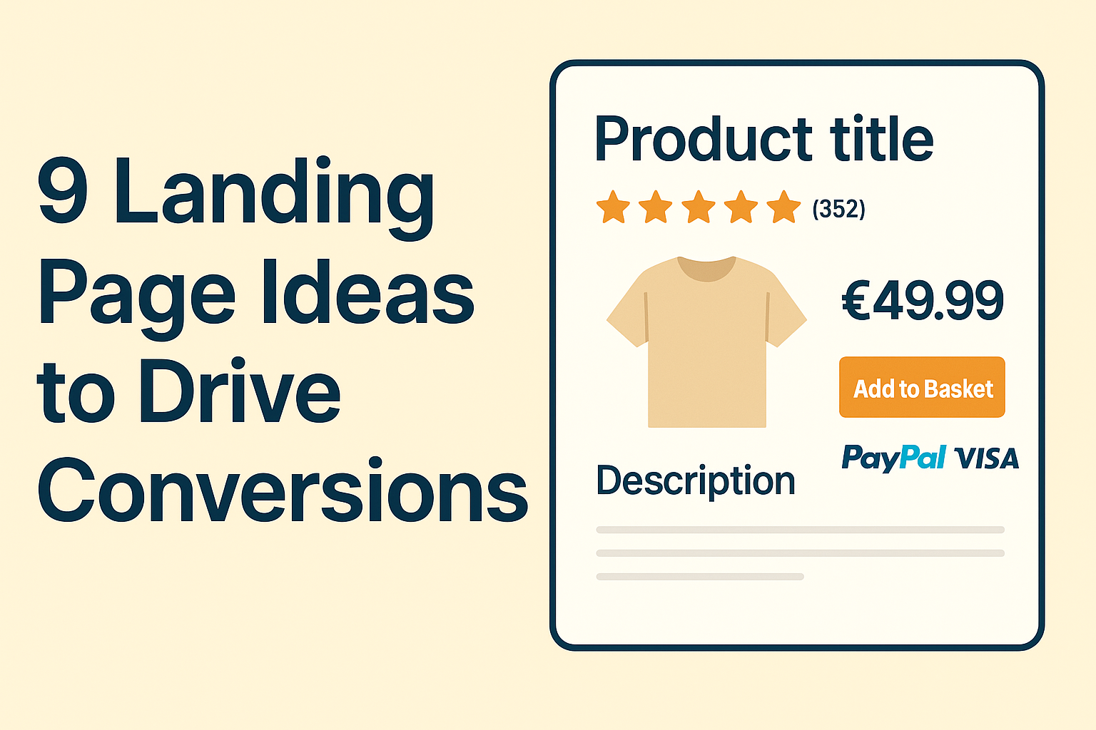
When someone lands on your product page, you’ve only got a few seconds to make it count. That’s why your landing page needs to be user-focused and designed with conversions in mind. A strong, well-optimised page can turn casual visitors into paying customers. A weak one could mean a sale lost in seconds.
And with so much competition in ecommerce, small tweaks to your landing pages can make a big difference to your conversion rates. Whether it’s a product page, a promotional landing page or something in between, your goal is the same: guide the visitor toward taking action.
In this blog, we’ll explore 9 practical landing page ideas designed to help you do exactly that.
Table of Contents
- 1. Make Your Value Proposition Clear and Impossible to Miss
- 2. Add Social Proof That Reassures
- 3. Guide the Visitor Toward a Clear Next Step
- 4. Reinforce Trust With Recognisable Payment Logos and Messaging
- 5. Keep the Layout Simple and Focused
- 6. Use High-Quality, Informative Product Photography
- 7. Optimise for Mobile First
- 8. Offer Flexible Delivery and Returns Info Upfront
- 9. Add Urgency or Scarcity (But Keep It Honest)
- Bonus Tip: Test It Like a Customer (Not Just a Designer)
- Final Thoughts: Small Changes, Big Impact
1. Make Your Value Proposition Clear and Impossible to Miss
Your value proposition should be the first thing people notice, and the clearest reason why they should buy from you. It’s your chance to grab attention in a split second and explain what makes your product or service worth their time and money.
This messaging often appears in your headline or subheading and should instantly reassure, inform and spark curiosity. It doesn’t need to explain everything — just the core benefits. A well-written value proposition makes a strong first impression that encourages visitors to click "Buy" or keep scrolling.
Your VP quickly communicate what you offer, who it's for and why it’s better than the alternatives. Keep it short, bold and benefit-led. Position it above the fold so it stands out straight away. If your main message sits in the headline, use a supporting line underneath to add a little more context and reinforce the value.
Example: Bloom & Wild- Convenient Letterbox Gifts
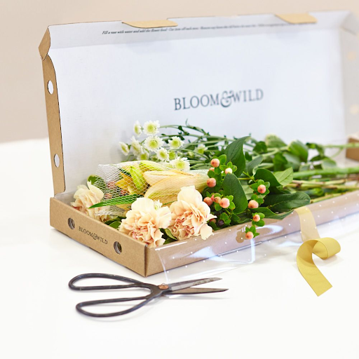
Bloom & Wild is a UK-based flower and gift delivery service known for thoughtful, convenience-first ideas. One of their main value propositions is “letterbox gifts” — a range of cocktails, treats and carefully curated items that are compact enough to fit through a standard letterbox.
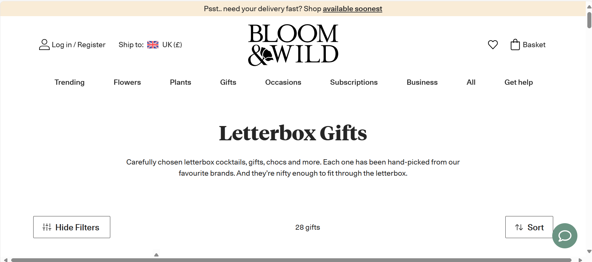
As shown in the screenshot above, their Letterbox Gifts page leads with a bold heading, followed by a short, benefit-led statement that reinforces their value proposition: convenient gifts sent with ease via the letterbox.
It’s clear, concise and immediately tells the visitor why these items are a great choice — convenience without compromise. It also pairs their core benefit (no need to be home for delivery) with a friendly, reassuring tone that matches their brand voice.
Top tip:
Think about these when working on your own value proposition:
What are you offering?
Who is it for?
Why does it matter or stand out?
Where is it displayed on your site?
2. Add Social Proof That Reassures
When someone lands on your page, they’re both consciously and subconsciously looking for reasons to trust you. That trust often comes from other people — not from you.
This kind of trust building is called social proof. Whether it’s customer reviews, star ratings, user-submitted images or trust badges like "Over 50,000 sold", these signals quietly reassure shoppers that real people have bought from you and were happy with the outcome.
Social proof is especially powerful when it appears near moments of decision. For example, instead of burying your five-star ratings at the bottom of the page, position them near your at the top of your page in center stage. If someone’s hovering over the “Buy Now” button, that’s the moment they need a little extra push, so seeing a 5-star review banner could do just that.
You don’t need hundreds of reviews. A handful of recent, positive pieces of feedback can go a long way in making your landing page feel trustworthy and credible — especially when paired with real names or photos.
Example: Hotter Footwear- Star Ratings and Customer Reviews
Hotter, a UK footwear brand, places social proof front and centre on its product pages.
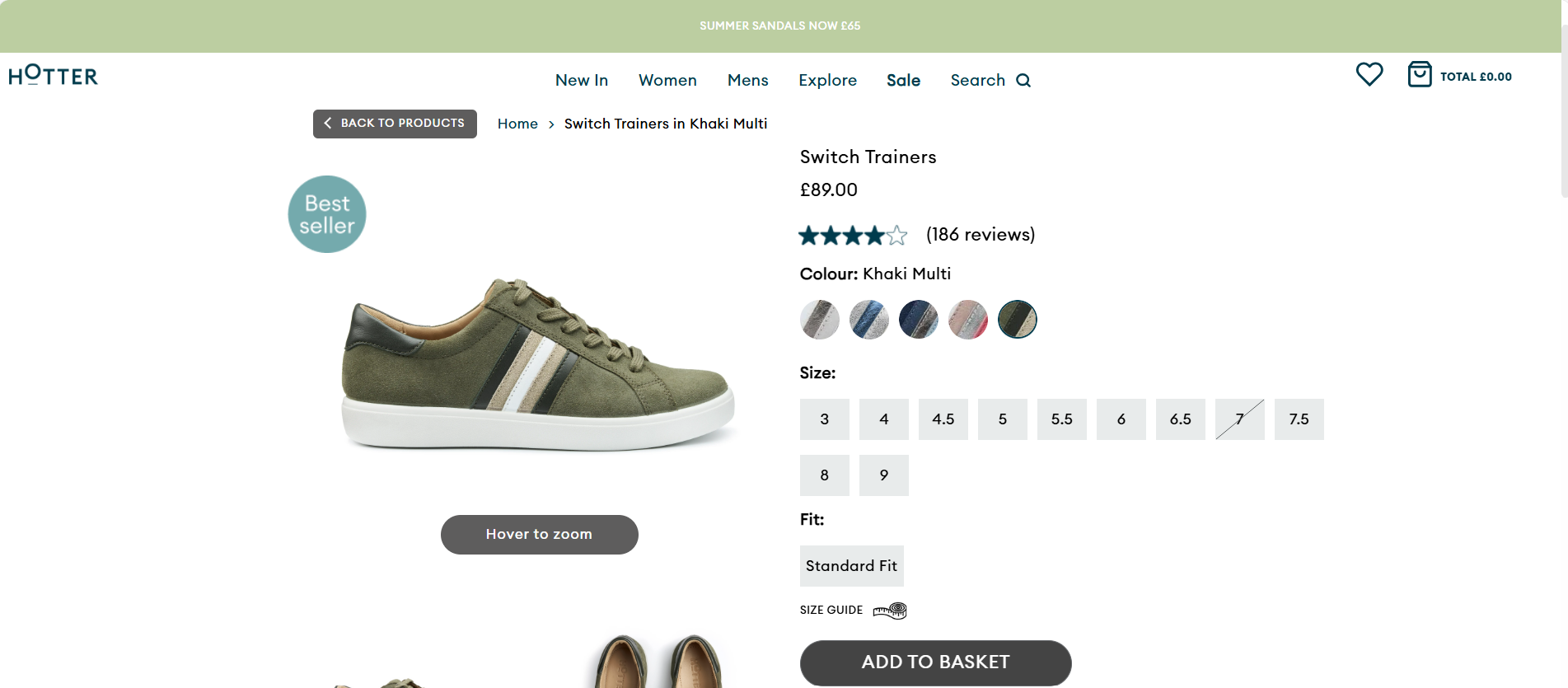
As seen in the product page screenshot above, customer star ratings and the number of reviews sit clearly beneath the product name, visible before scrolling. A dedicated tab below showcases full written reviews, often with users adding helpful feedback on comfort, fit and real-life use. It’s exactly the kind of insight that reassures hesitant shoppers.
By pairing star ratings with detailed comments, Hotter gives users a clear sense of what to expect before they buy. This not only adds credibility, but helps reduce uncertainty — especially for customers shopping online for shoes where sizing and comfort are key.
Top tip:
Display ratings and review counts close to the product title or pricing. Use full review tabs to show written reviews further down to build trust. And if customers include photos, even better.
3. Guide the Visitor Toward a Clear Next Step
Your landing page should guide visitors toward the action you want them to take and make that action effortless. On a product page, that usually means a clear, visible Add to Basket or Buy button.
It’s never a bad idea to have your button towards the top of the page, before the description, to capture those super eager buyers acting on impulse. If your products have variations, place it close to the option selectors. If a visitor has to scroll or search around to select a size or colour or to see things like bonus reward points, they’re more likely to hesitate.
In short, make sure everything key to the sale is clear and easy for the user to interact with.
If you’re aiming for sign-ups instead of purchases, keep the form simple and place it high on the page. Avoid unnecessary fields and keep the layout clean.
A strong, benefit-led CTA can also help seal the deal. Things like:
- “Get 10% Off Your First Order”
- “Start My Free Trial”
- “Add to Basket for Double Rewards Points”
If there’s an incentive in play, make sure it’s clearly tied to the action you want them to take. The clearer and more convenient the next step feels, the more likely someone is to take it.
Example: Gymshark- Clear Action Buttons to Guide the User
Gymshark, the UK-based fitness brand, provides a great example of how to guide visitors toward a clear next step on a product page.
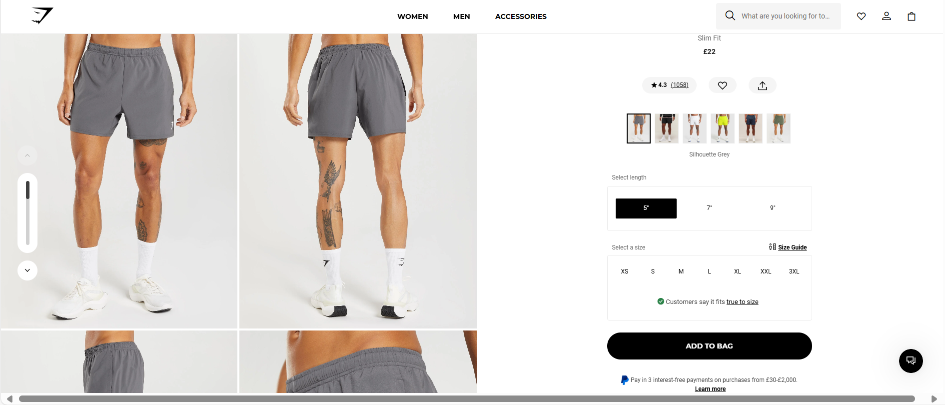
On their product pages, the “Add to Bag” button is prominently displayed above the fold, ensuring immediate visibility. It is placed before the product description, and after some key variant selectors for length, size and colour, allowing users to make selections without unnecessary scrolling. Key information like a size guide, payment methods and social proof are also presented near the purchase area to give customers everything they need in one view. The addition of the Pay in 3 PayPal messaging next to the “Add to Bag” button is a nice touch for customers who may be looking for split payment options.
Top tip:
Make your buttons and option selectors logical and easy to use. If you have additional text, ensure your call-to-action (CTA) is compelling and reinforces value. Use benefit-led copy like “Add to Basket – Free Next-Day Delivery” or “Sign Up and Get 10% Off” instead of generic phrases. If you’re offering a perk, place it right next to the button so there’s no risk of it being missed. If you offer spread out payment methods, be sure to highlight this too.
4. Reinforce Trust With Recognisable Payment Logos and Messaging
When someone’s on the verge of buying, trust matters. One subtle but powerful way to build it is by displaying familiar payment method logos where they can be seen.
Logos like Visa, PayPal, Klarna and even store cards send a strong visual cue that your store is secure, flexible and easy to buy from. These trusted brand marks reassure visitors that checkout will be smooth and familiar.
They’re especially useful for new customers who haven’t shopped with you before. Seeing a logo they recognise can ease uncertainty, add credibility and even increase the likelihood of a conversion.
Example: Argos – Making Payment Options and Logos Visible
Argos, one of the UK’s most recognised retailers, places accepted payment methods directly below the price on their product pages — not buried in the footer or hidden at checkout. As shown in the screenshot, customers can instantly see they can pay using an Argos Card, PayPal or Klarna to spread their payments.
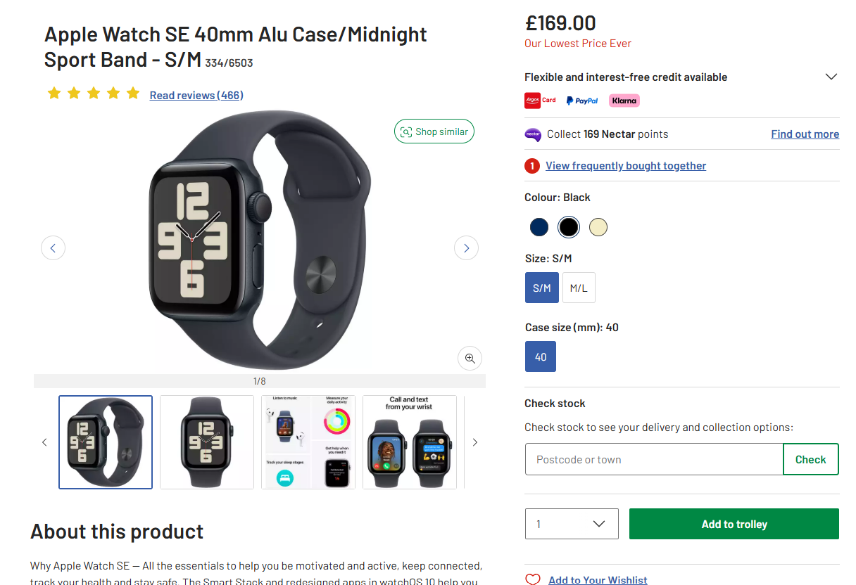
It’s clear, visual reassurance placed exactly where the buying decision happens. It pairs seamlessly with the CTA button, price and incentive messaging like Nectar Points, strengthening trust and nudging the customer closer to purchase.
Top tip:
Place your payment method logos near the Add to Basket button or price. Don’t make users scroll to the footer to see how they can pay — show them up front and make the experience feel safe and straightforward.
5. Keep the Layout Simple and Focused
A landing page doesn’t need flashy animations or cluttered visuals to be effective. In fact, the best-performing ones are often the simplest. Clean layouts with smart use of white space help guide the visitor’s eye, reduce overwhelm and keep the focus on the action you want them to take.
Strip back anything that doesn’t support your main goal. That includes busy menus, unnecessary pop-ups or auto-playing videos. Keep content clear and the design intuitive, so the next step feels obvious — not buried.
Example: Nike – Clean Design That Drives Action
Nike’s product pages are a masterclass in simplicity.
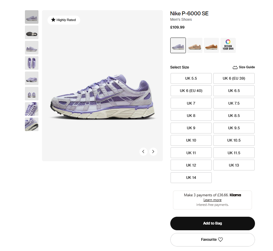
The page design is clean and spacious, making smart use of white space to highlight key elements like the product imagery, size selector and Add to Bag button. There are no distractions — just a smooth, focused experience that makes it easy to choose a size, pick a colour and check out in a few clicks.
Additional product details, reviews and care instructions are available — but they are neatly tucked away in collapsible tabs beneath the fold. This keeps the initial view uncluttered while still giving curious shoppers all the info they need.
Top tip:
Prioritise clarity over creativity. A clean, well-structured page helps users focus on what matters and guides them towards buying. If anything else on the page feels like a distraction, get rid of it.
6. Use High-Quality, Informative Product Photography
Great product photography does more than just show what something looks like— it helps the customer take a closer look, assess the product’s quality and picture it in their life. From a landing page perspective, your images do the talking before the text does. That means they need to be clear, high resolution and purposeful.
Start with a clean hero image on a white or neutral background to show the full item. Then use additional photos to bring the product to life: different angles, zoomed-in details, lifestyle settings and context shots all help the shopper understand what they’re buying.
Done well, your images will help build trust, reduce hesitation and help people picture your product in their own space — which can be the difference between bouncing and buying.
Example: MADE – Multiple, Helpful Product Images
MADE.com nails this with their Sassari Garden 4 Seater Dining Set page. The first image presents the product cleanly on a white background, with no distractions. But as you scroll, the carousel reveals much more, including close-up shots showing the texture and materials, styled lifestyle photos that show the set in a sunlit outdoor setting and also a product diagram clearly displaying the measurements.
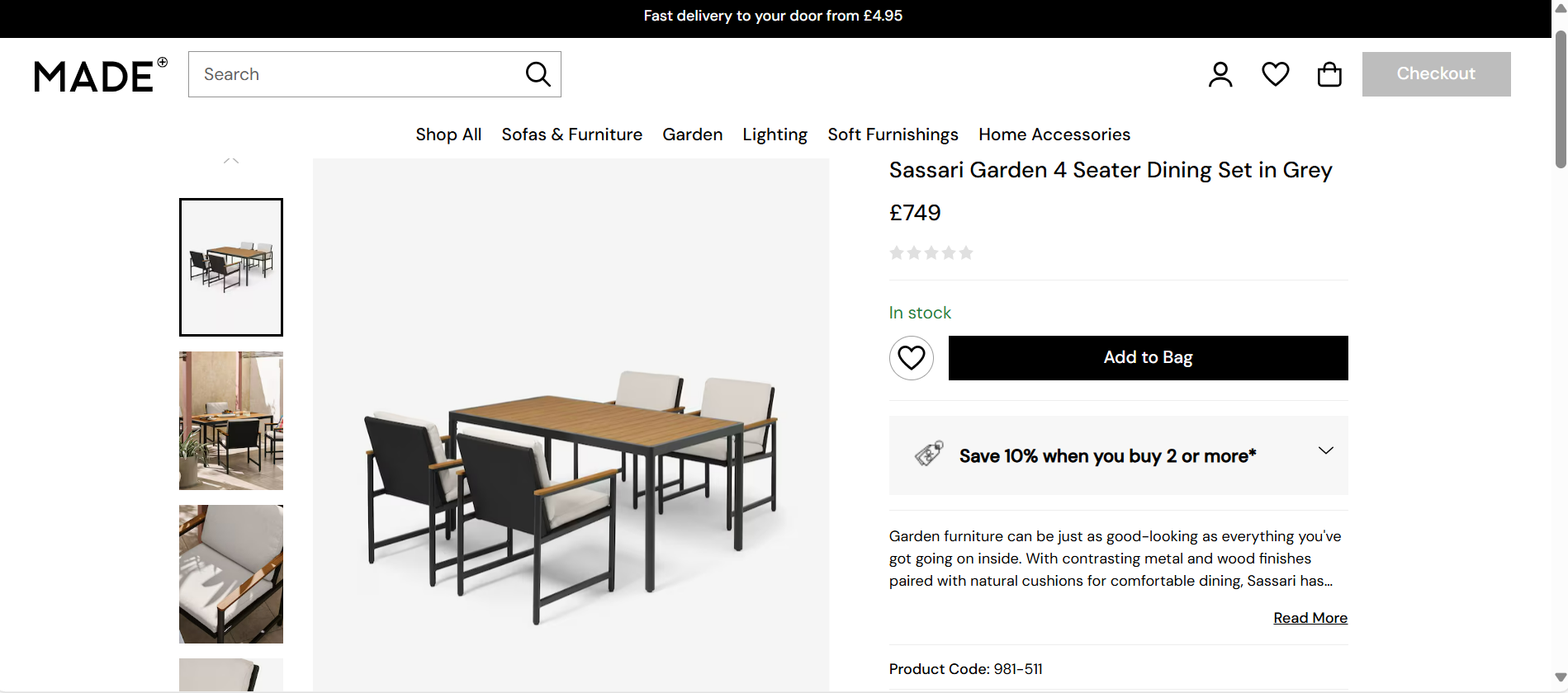
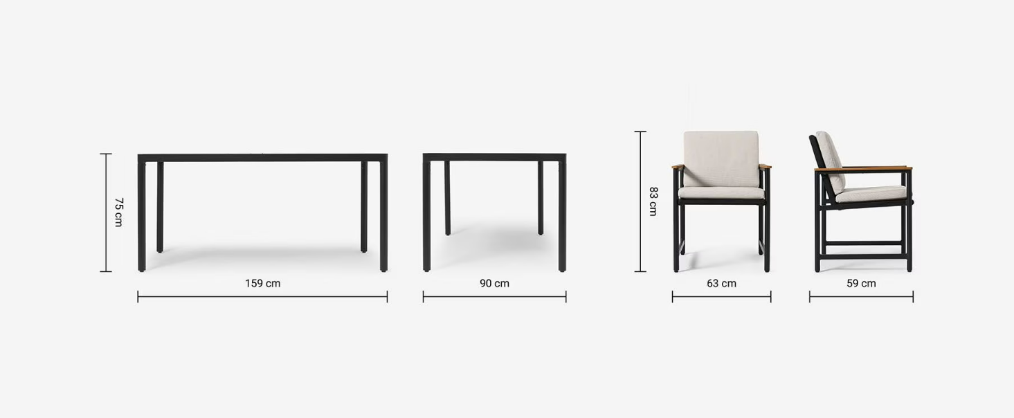
Each image does a specific job, helping the customer build a full picture of what they’re getting and how it might fit into their life — visually, practically and emotionally.
Top tip:
Use a mix of image types:
- One clean hero shot
- One close-up
- One lifestyle image
- One contextual or scale-based photo
- Showcase your product in action, not just in isolation.
7. Optimise for Mobile First
With mobile now accounting for the majority of ecommerce traffic, your landing pages need to look great and function flawlessly on smaller screens. If your layout only works well on desktop, you’re probably missing out on lots of potential conversions.
Mobile-first design means creating a layout that’s easy to scroll, quick to navigate and focused on the essentials. That includes large tap targets, swipe-friendly image galleries and keeping key actions like “Add to Basket” high on the page and easy to tap. The goal is to reduce friction — no pinching, zooming or guessing where to click. Touch-friendly design, fast load speeds and clean, uncluttered content all help users make quick decisions without feeling overwhelmed.
Example: Boots — Clean, Tap-Friendly and Built for Scroll
Boots does a great job of optimising for mobile without overwhelming the shopper. Their product pages are designed as a vertical scroll, with no horizontal navigation needed. When the page loads, the product image includes a subtle “double tap to zoom” instruction — an intuitive feature that makes it easy to explore the product in more detail.
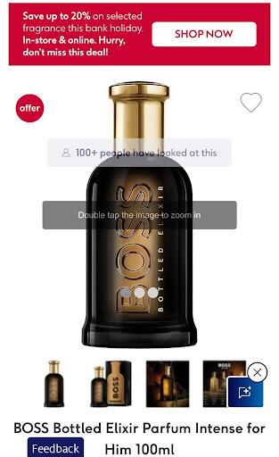
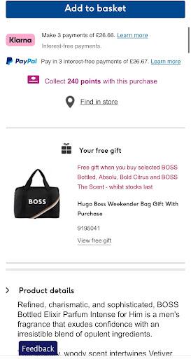
Just below the image, you’ll find a clear Add to Basket button, along with flexible payment options like Klarna and PayPal, and loyalty point info, all grouped together in one place. As you scroll, more details follow including the product description and promotional offers. It’s structured, spacious and fast, giving shoppers everything they need without friction.
Top tip:
Use real devices to test your mobile pages, not just browser previews. Make sure users can tap, scroll and convert quickly without squinting, zooming or hunting for the buy button. Many ecommerce platforms come with mobile-optimised templates, so the job’s already half done. But it’s still important to check that your product pages feel just as smooth and shoppable on mobile as they do on desktop.
8. Offer Flexible Delivery and Returns Info Upfront
Even if someone loves your product, uncertainty around delivery or returns can force them reconsider. That’s why it’s so important to surface key delivery and returns info directly on your landing page and not just buried in your FAQ or delivery page.
Shoppers want to know how much delivery will cost, how long it’ll take and what happens if they change their mind. Being upfront about this not only builds trust, but removes friction from the buying decision.
Highlight options like:
- Free UK Delivery over a certain amount
- Next-Day Dispatch on orders placed before a specific time
- Hassle-Free 30-Day Returns
Even better, pair this info with visual cues like icons near the price or Add to Basket button. The more confident someone feels about what happens after checkout, the more likely they are to follow through.
Example: BoohooMAN — Delivery Pricing and Returns, Clearly Displayed
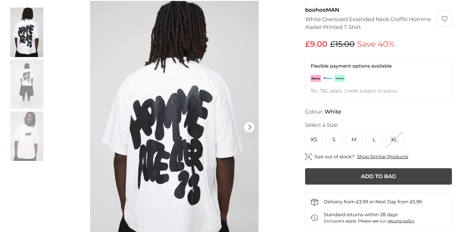
On BoohooMAN’s product pages, delivery and returns details are placed directly below the Add to Bag button. Pricing for standard and next-day delivery is shown clearly: “Delivery from £3.99 or Next Day from £5.99.” Just beneath that, shoppers see a simple line stating “Standard returns within 28 days.” It’s all laid out clearly, in the right place, and helps remove doubts right before purchase.
Top tip:
Include key delivery and returns info directly on your product pages. If you offer next-day delivery, consider adding a simple “order by” cut-off time to help set clear expectations.
9. Add Urgency or Scarcity (But Keep It Honest)
Urgency nudges people toward action — but only if it feels authentic. Limited-time discounts, low stock notices or countdown timers can all help reduce decision delay and boost conversions in the moment. These tactics tap into a fear of missing out and can be especially powerful during sales or seasonal pushes.
That said, urgency only works when it’s real. Shoppers are quick to spot fake scarcity or misleading messages, and trust is hard to rebuild once lost. The best urgency tactics are subtle, truthful and tied directly to real stock levels or promotions.
Example: Kitchen & Bath Authority – Real-Time Stock and Cart Activity
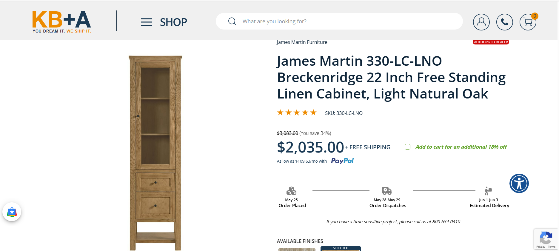
Kitchen & Bath Authority combines urgency and scarcity effectively on their product pages. On their listing for the James Martin Linen Cabinet, customers are shown a live message stating “13 In Stock. Hurry! 14 Added To Cart Today,” right below the Add to Cart button.
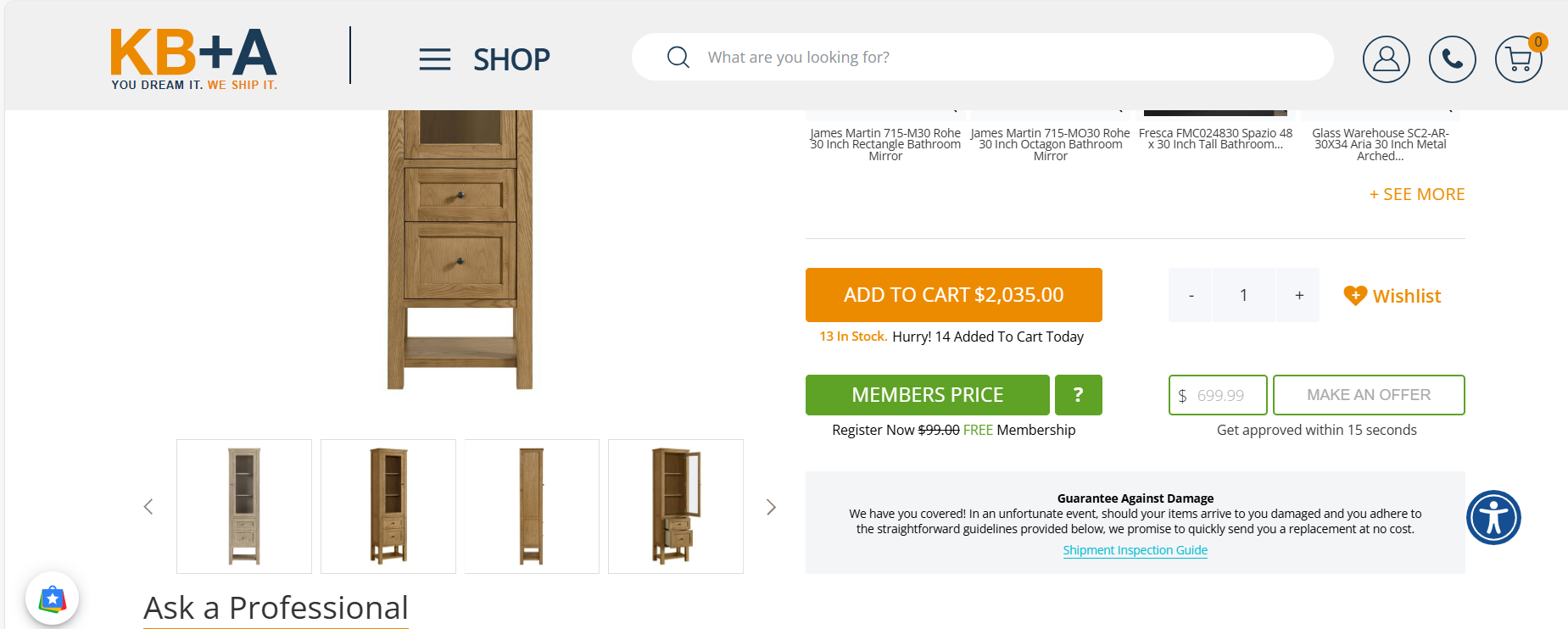
This not only signals limited availability but also implies demand — a powerful psychological nudge. Earlier on the page, they also offer an incentive: “Add to cart for an additional 18% off,” reinforcing action in the moment. It’s clear, specific, and tied directly to buyer behaviour, without feeling pushy or manipulative.
Top tip:
Use urgency to guide action, not pressure. Low stock notices, limited-time offers or time-sensitive perks like next-day delivery cut-offs can all drive conversions — as long as they’re real.
Bonus Tip: Test It Like a Customer (Not Just a Designer)
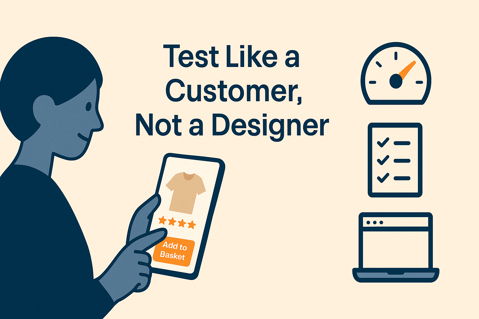
You’ve built the page. The design looks great. The content reads well. But the question is — does it work?
Don’t just stop at launch. To make your landing pages perform, you need to test them like a customer would. That means:
- Page speed checks: Use tools like Google's PageSpeed Insights or GTmetrix to make sure your page loads in under 3 seconds. Slow-loading pages = higher bounce rates and lower conversions. Even a 1-second delay can cost you sales.
- Real device testing: Open your product page on your actual phone. Tap through it. Try different browsers. If you have to zoom, pinch or wait… so will your customer.
- Conversion tracking: Use analytics tools like Google Analytics to monitor bounce rates, clicks, scroll depth and time on page. These tell you what’s working — and where you’re losing people.
It’s easy to get attached to a layout or design choice, but the numbers don’t lie. Sometimes a colour tweak, button move or one line of extra delivery info can make a noticeable difference.
Final tip: Don’t just aim to launch great landing pages — aim to learn from them. Every click, bounce and scroll is feedback.
Final Thoughts: Small Changes, Big Impact
A high-converting landing page isn’t about having a flashy design or clever gimmicks — it’s about clarity, trust and momentum. From showing your value fast to guiding visitors toward action with reassurances and perks along the way, every section of your page plays a role in whether someone bounces or buys.
The good news? You don’t need to reinvent the wheel. The 9 ideas in this guide are practical, proven and ready to implement — especially if you’re using the right ecommerce platform.
ShopWired: Built for Conversions

Everything you’ve seen in this blog — from mobile-friendly layouts and social proof to trust-building payment processors and customer incentives— is fully supported on ShopWired.
With built-in marketing tools, customisable theme templates, fast page speeds and a conversion-optimisation in mind, ShopWired is built to help you turn more clicks into customers.
Explore our full range of ecommerce features here.
Start your 14-day free trial — no credit card needed.